The World's First Volumetric Human Capture App
8i - HOLO

Mix Your Reality
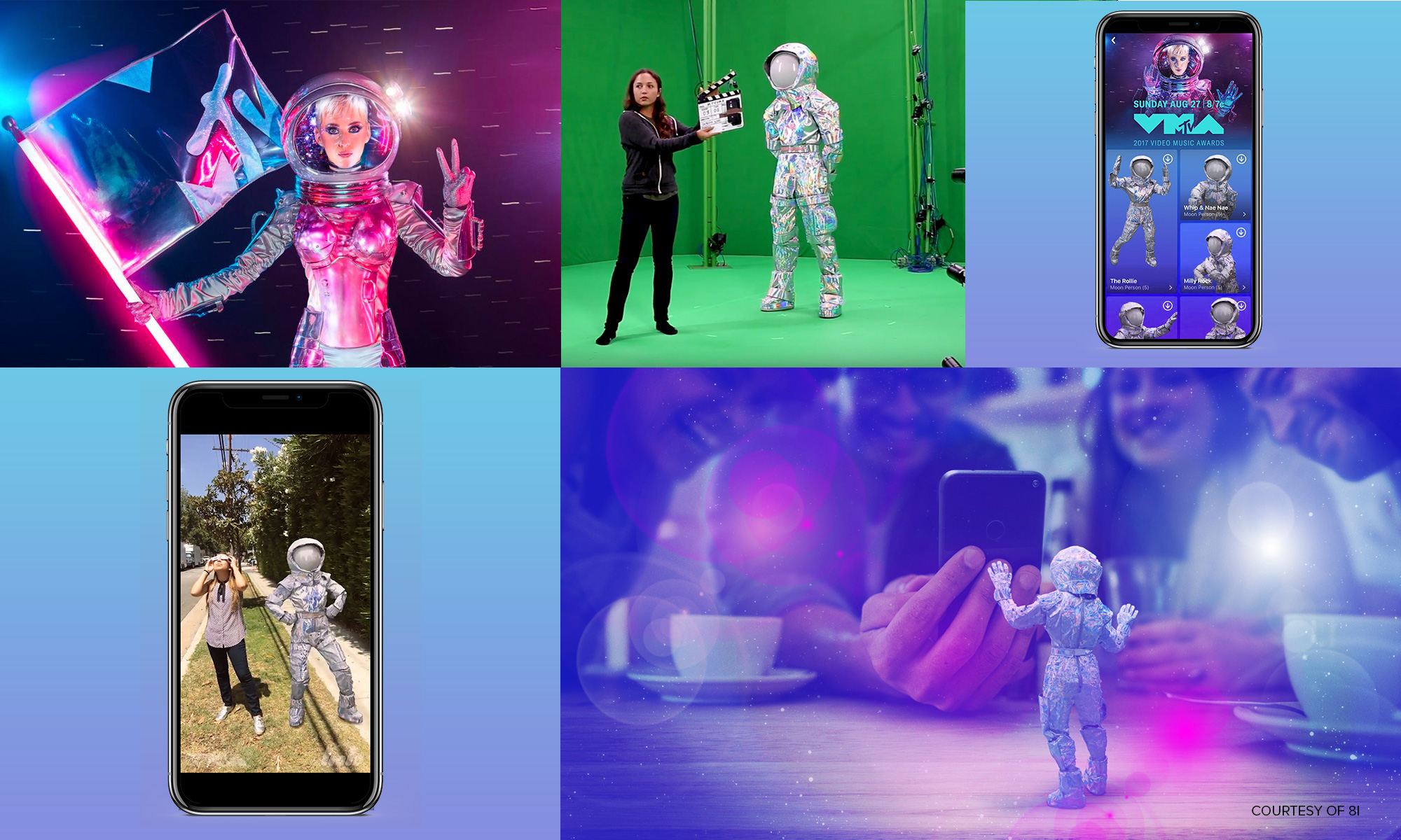
Signature teamed up with 8i, a volumetric human capture company, to create the first mobile app to put holograms into smartphone cameras. As product lead, we provided AR app design, branding, strategy, and user experience, while 8i supplied the cutting-edge holographic technology.
Our Contribution
MARKET AND USER RESEARCH
Consumer ProfilingCompetitive Analysis
Market research/Trends
VISION, STRATEGY
Internal Stakeholder AlignmentInternal Vision Roadmap
Business Model Review
Brand/Marketing/Comms Strategy
Content Strategy
Launch Strategy
PRODUCT DEFINITION
Product RecommendationsProduct Roadmap
User Stories
Feature Definition
Analytics Definition
UX/UI
Prototyping
Usability Testing
A/B Testing
Technical Architecture
DEVELOPMENT
Web Frontend (Desktop and Mobile)PRODUCT & TECHNICAL SUPPORT
Technical Scope and Resource ManagementProject Planning
Technical Oversight of Development
Q/A Testing
User Feedback Testing
Ongoing Product Strategy and Management
BRAND
StrategyBrand Positioning
Brand Voice
Communications Architecture
Copywriting
DESIGN
Logo DevelopmentToolkits and Style Guide
Media Libraries (Email/Motion/Print/Digital Display/Sales)
Creative Templates & Assets
Focusing On the User
At the time, content creators & consumers had not been introduced to the concept of adding holograms to live videos. While we could count on early adopters to try out the app, we knew it would be difficult to connect with wider audiences.
To solve this challenge, we investigated and defined the product in a comprehensive process that aligned internal stakeholders, examined the marketplace, and identified consumer trends through focus groups.
Rapid Prototyping
We began testing the app with users and major influencers every two weeks. Within 24-hours of each session, we had analyzed the feedback and provided critical information to the development teams to iterate for the next round of user testing.
Each session provided more information on how to market the app, adjust the content strategy, and adjust the user experience.
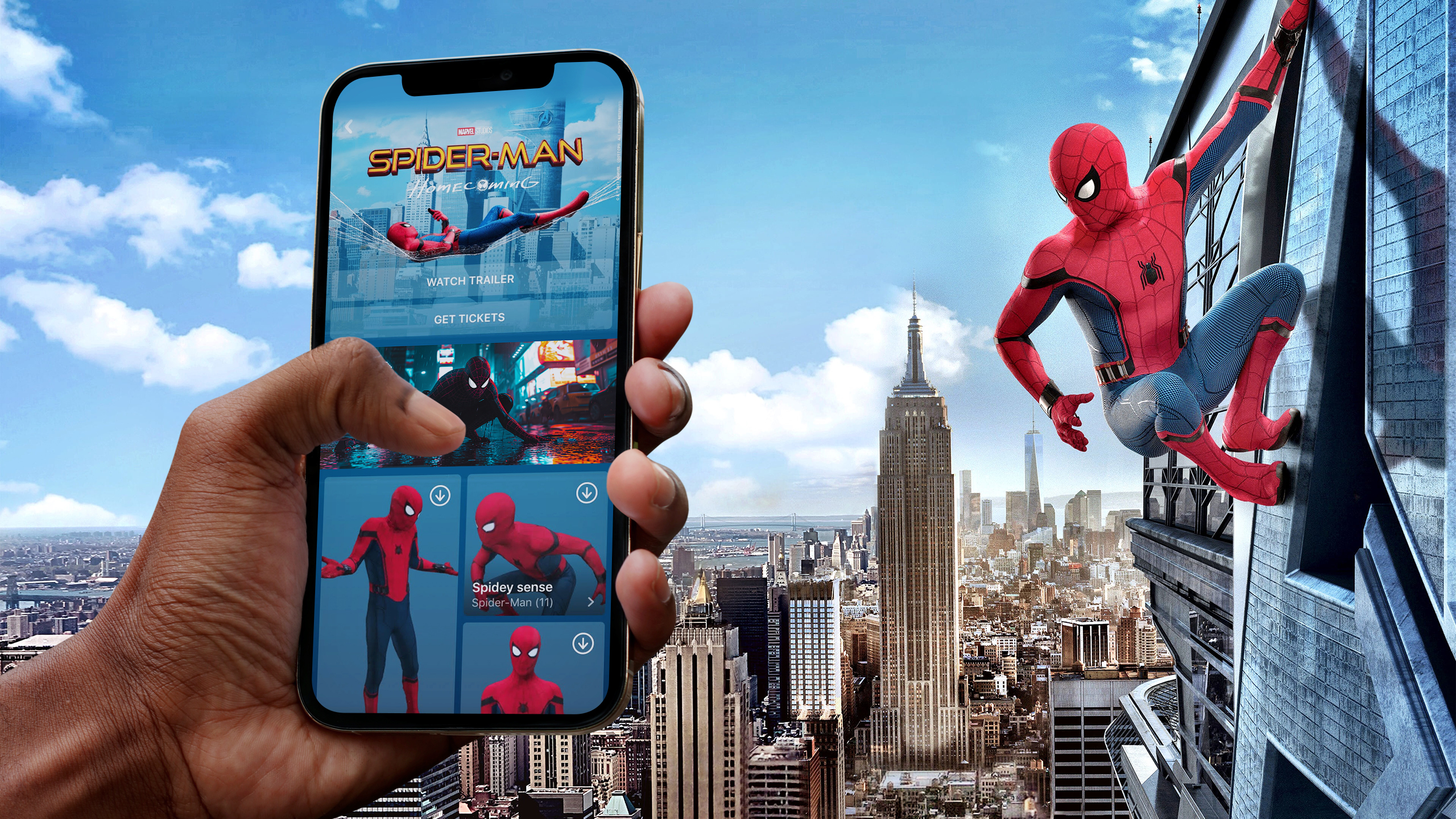
When a partnership with Marvel came into the mix, our team pushed hard to finalize development and create a Spider-Man hologram just in time to launch the app internationally alongside the premiere of Spider-Man Homecoming.
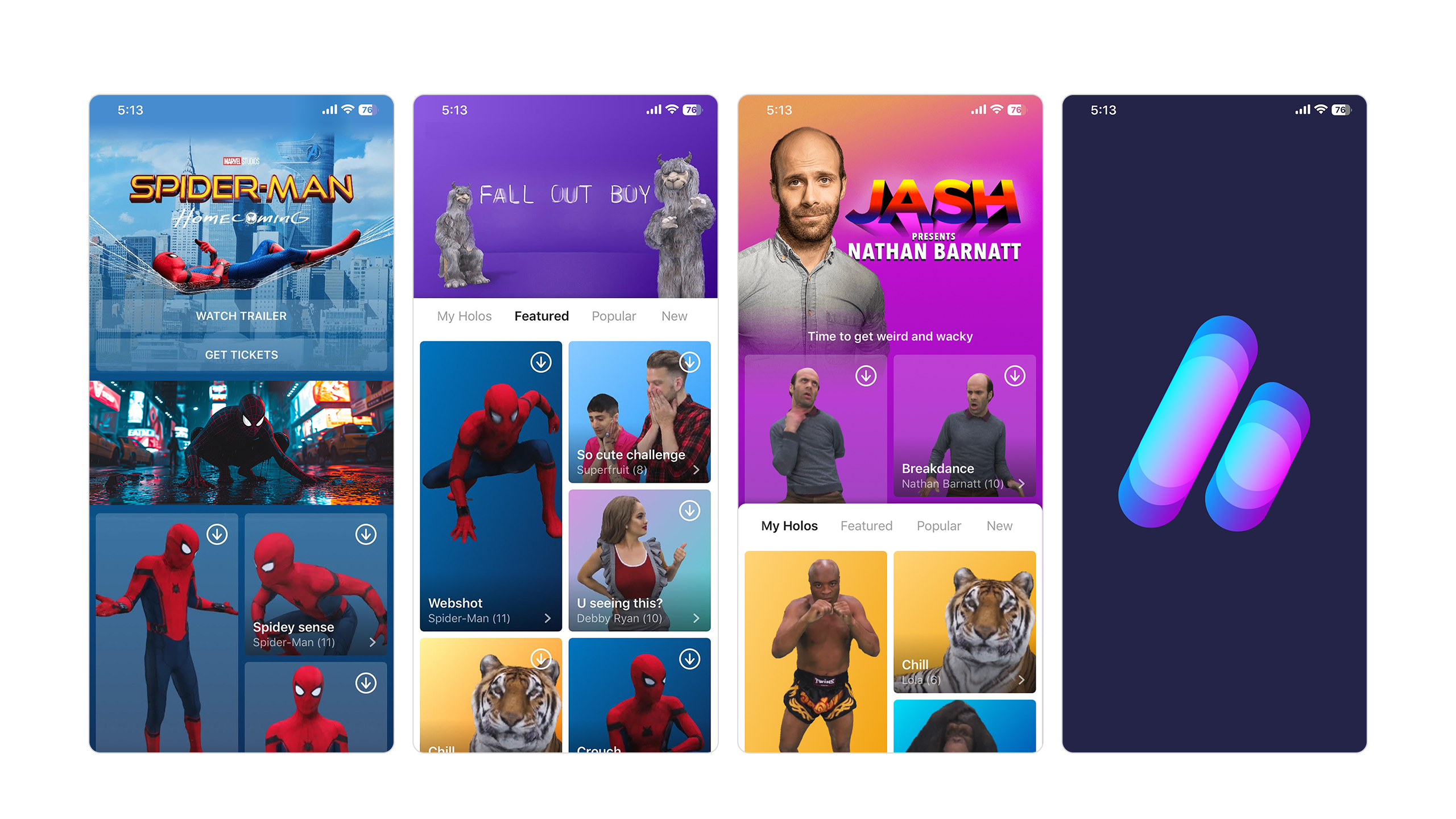
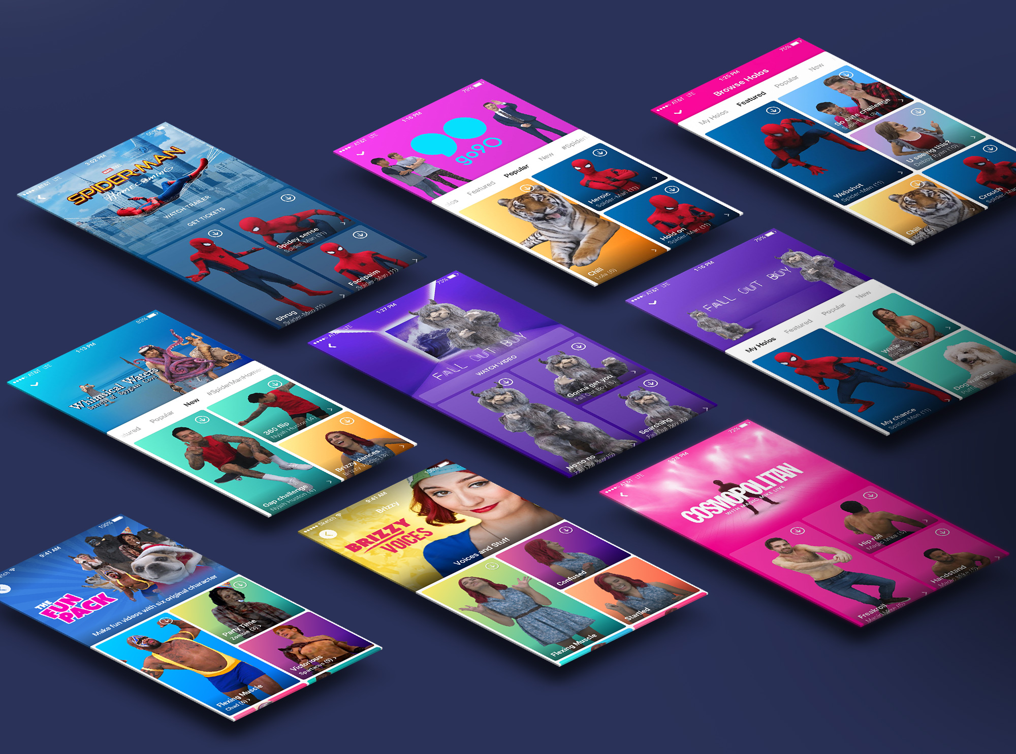
Holo hit the market with extremely high download and engagement numbers, and was praised for its solid user interface, user-directed content, and holographic library of superpowered IP.
