Life Elevated
to Primary
Primary

What’s Your Story? Ours begins here.
Primary.Health started out as a volunteer effort in a little California town and has grown into a high quality, scalable all over the country operation when it comes to prevention, testing and vaccination of airborne disease. Our task was to make their brand identity catch up and take that same big leap.
Our Contribution
MARKET & USER RESEARCH
Competitive AnalysisMarket Research/Trends
BRANDING
Full Brand RedesignDIGITAL
UX & UIWeb Dev
PRODUCT
UX & UICORP COMMUNICATIONS
All aspects of CollateralThe Heart of what we do
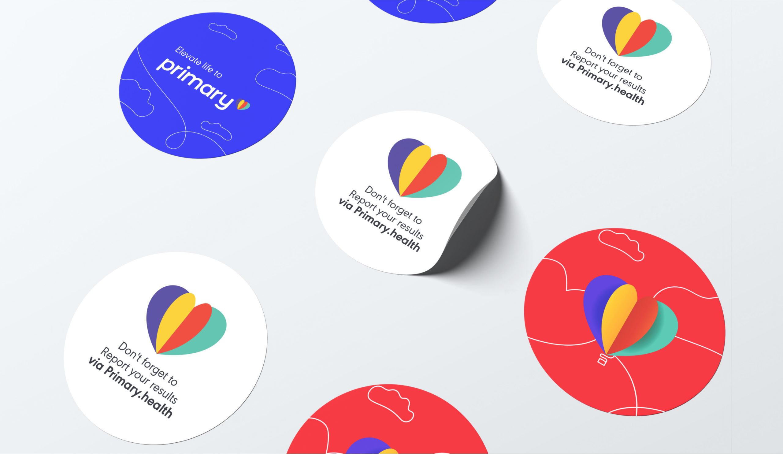
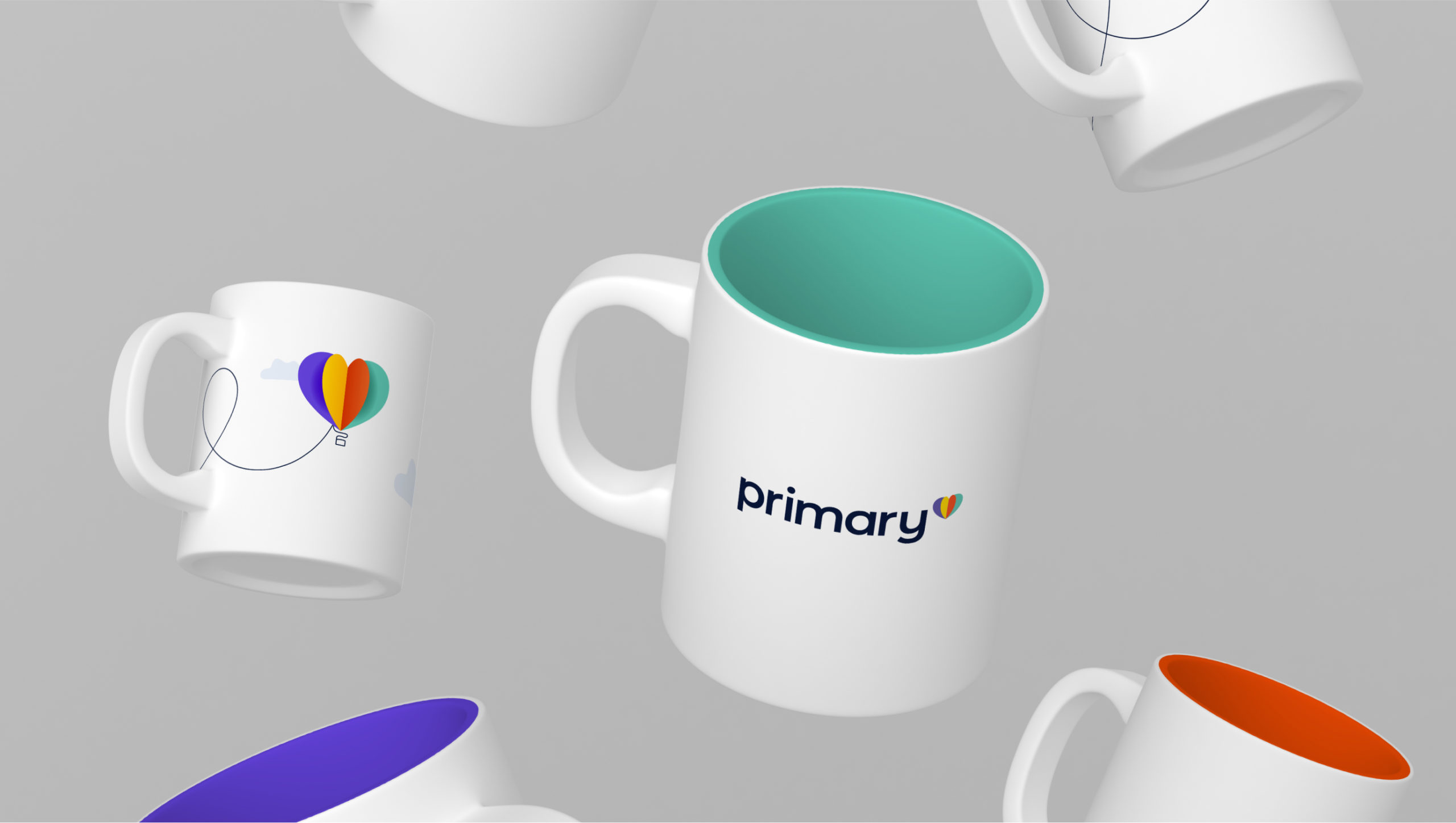
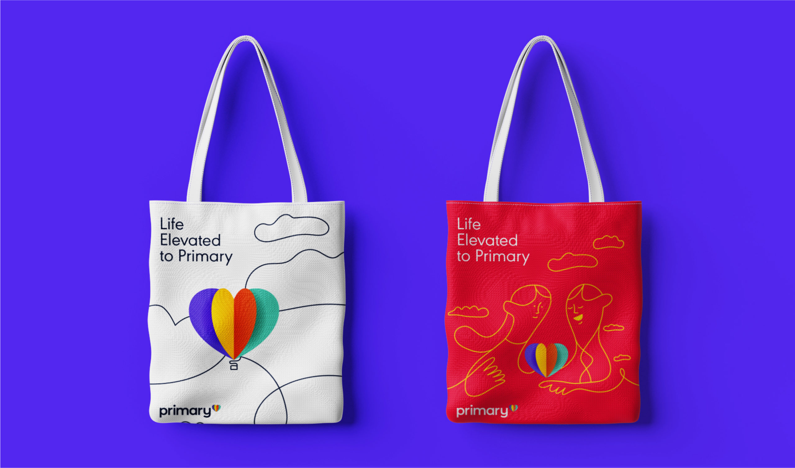
We explored different concepts and logos. From keeping only the “P”, to making the one-line-doodle the protagonist. But in the end, we kept the Heart that the whole team had grown so attached to, because it represented them. Primary is about people, about caring, about guaranteeing a healthy community so each person can live to the fullest.
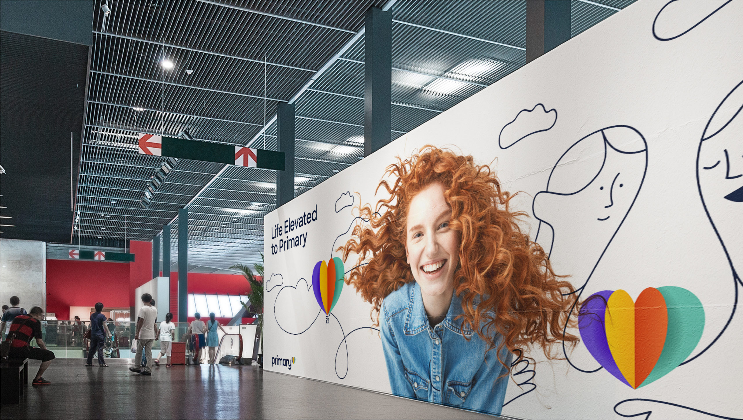
And so, our heart was transformed into a multi-layered colorful one. A heart that resembles a book, with the story of each person they attend to. Or a heart that is sometimes a balloon, because people can elevate life to primary. If you pay attention, the heart is always elevated and floating by in our logo. These concepts evolved into powerful designs and storytelling devices.
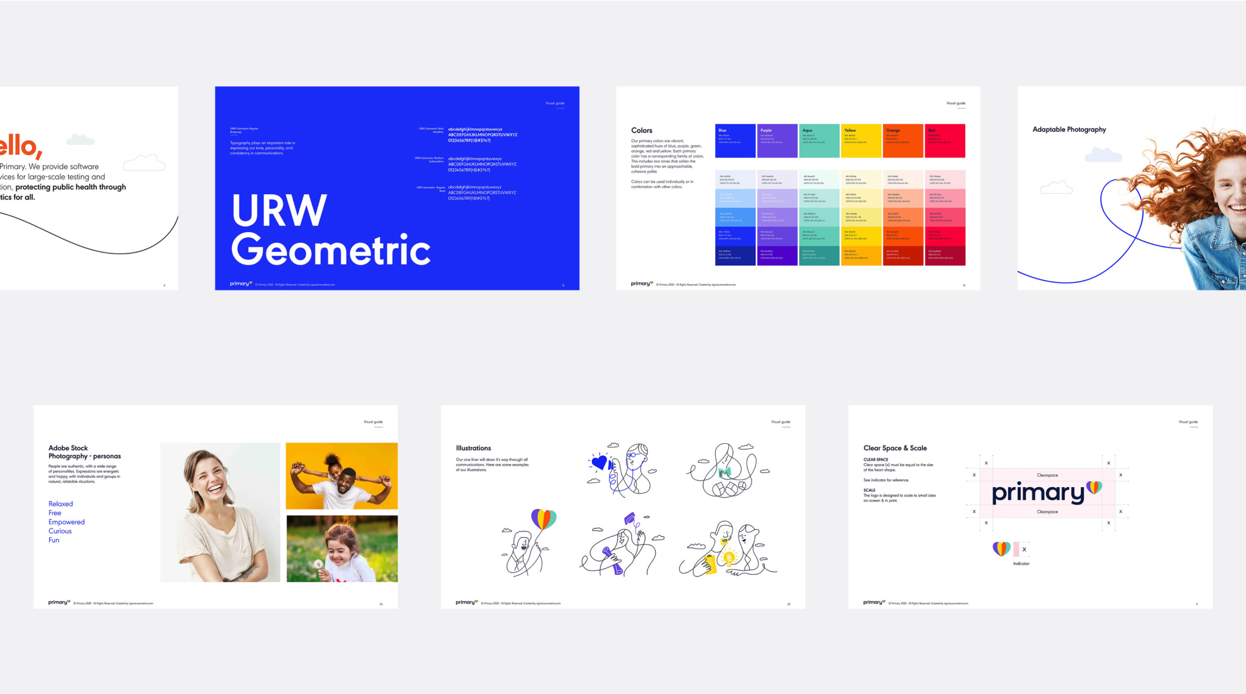
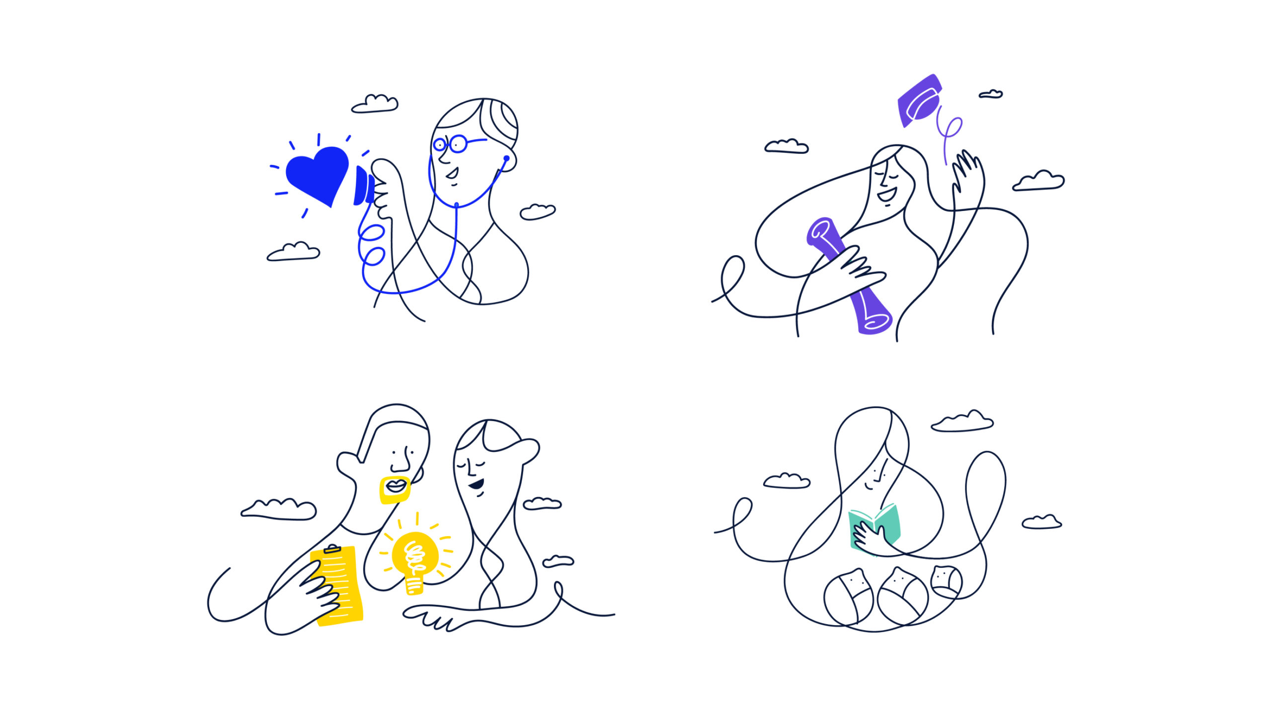
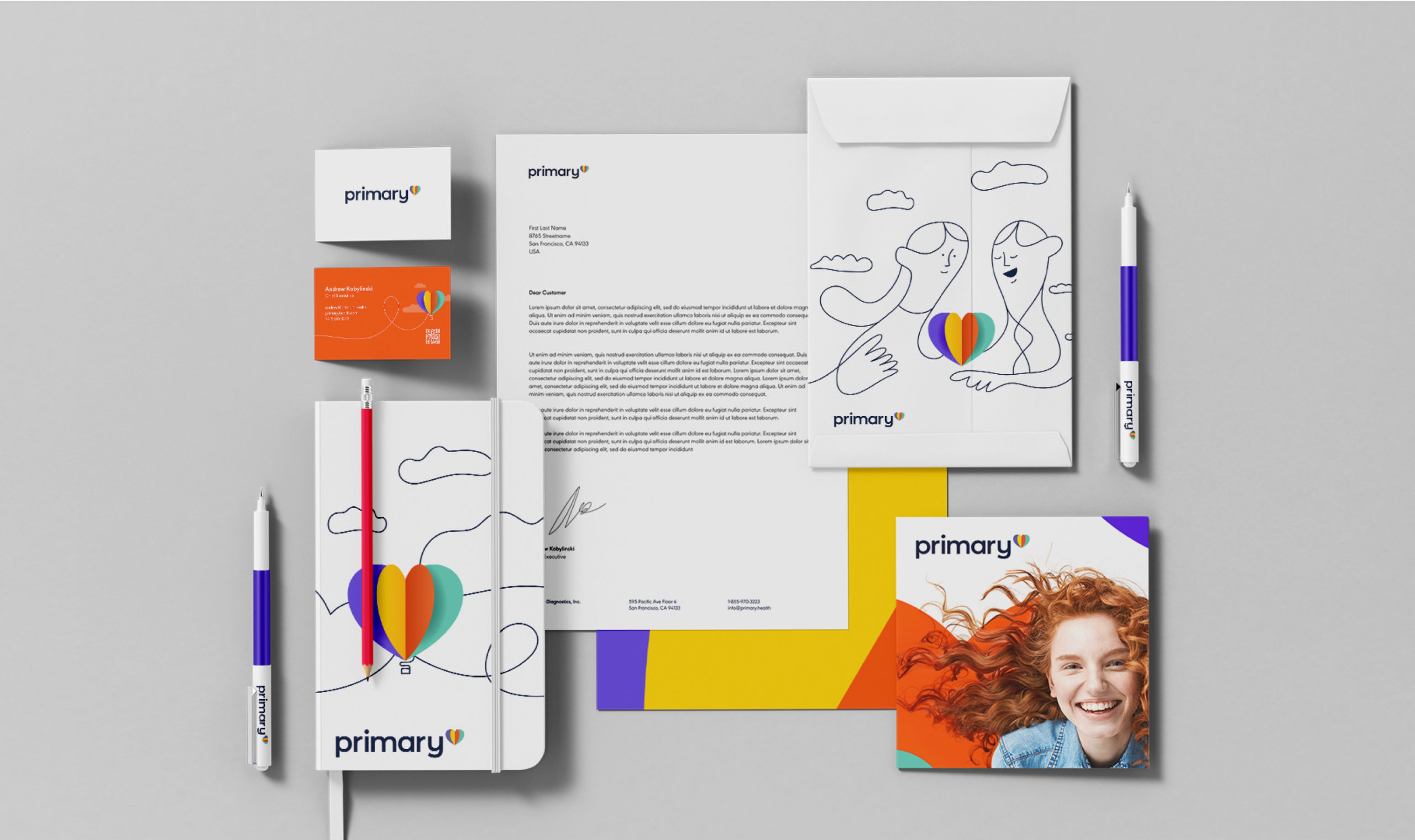
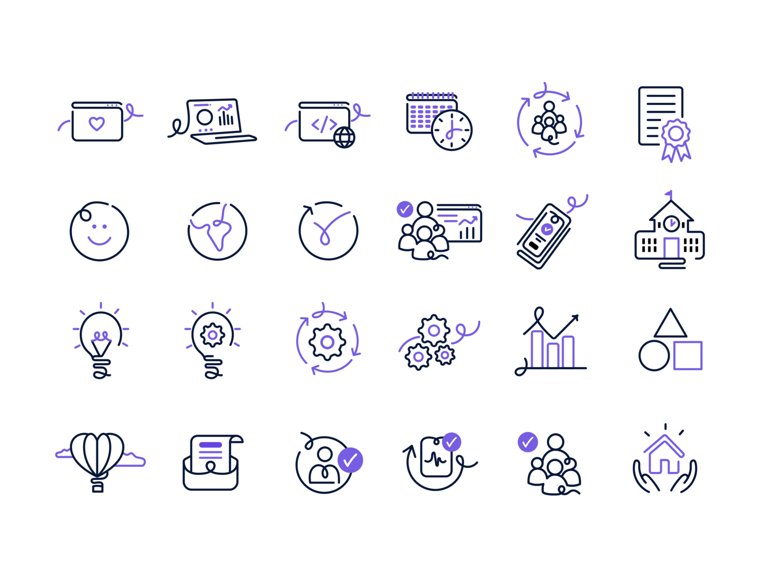
You’re The Star
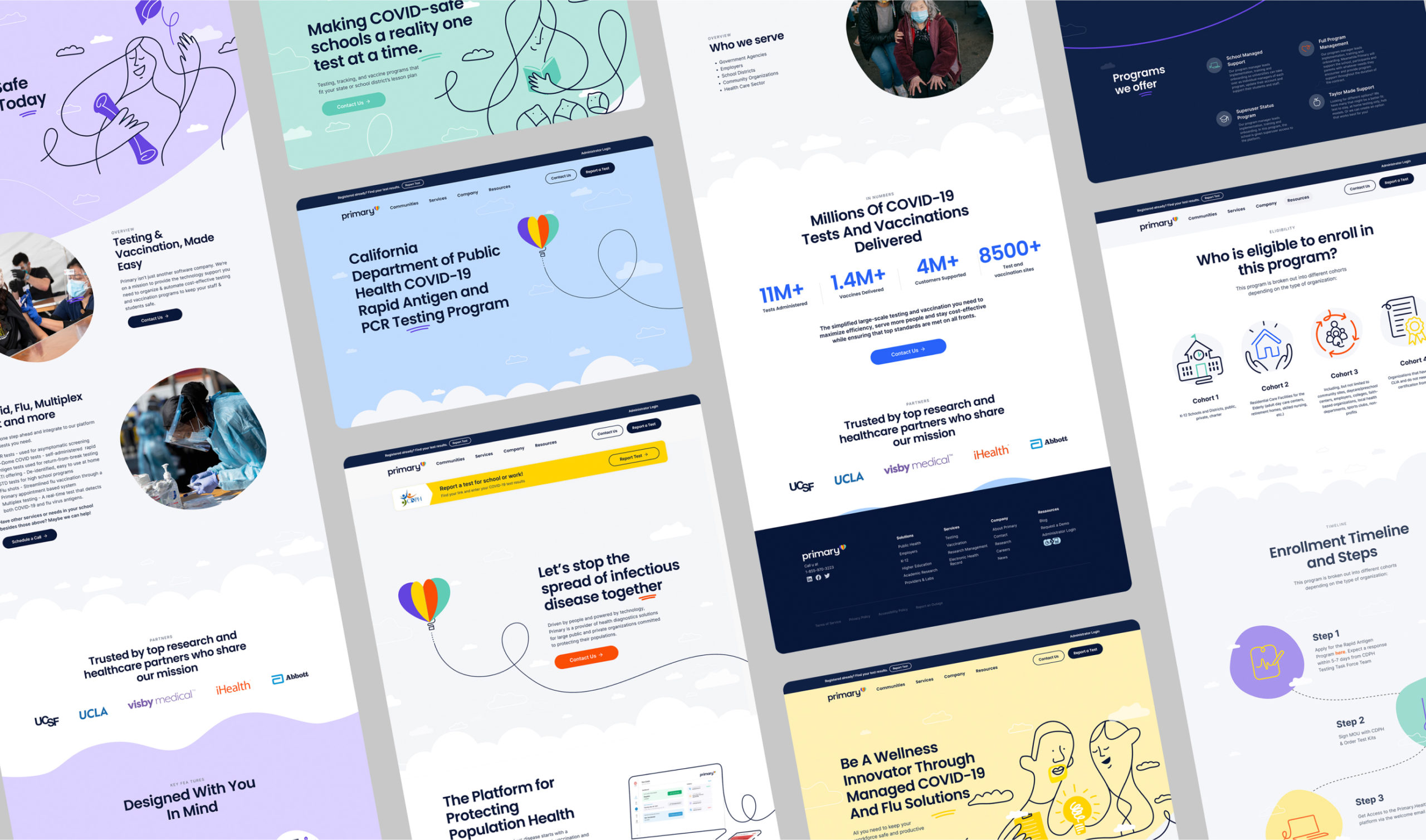
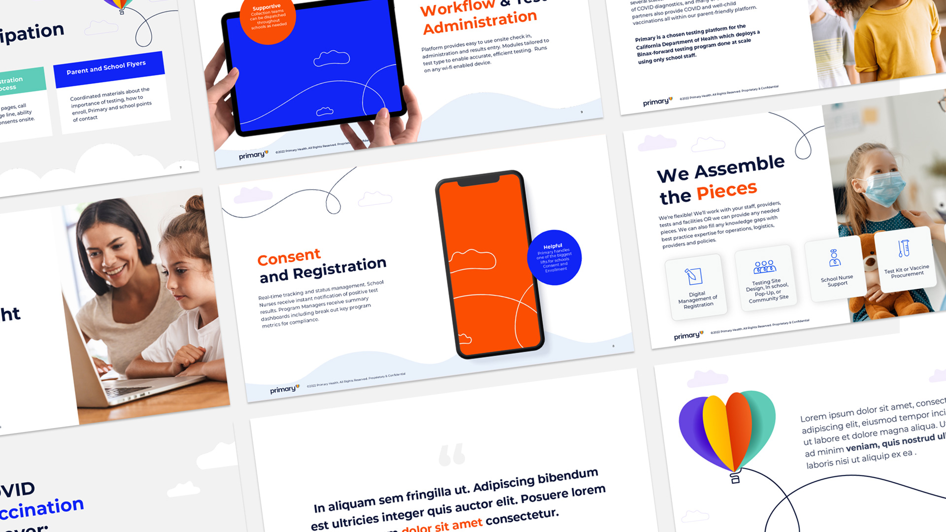
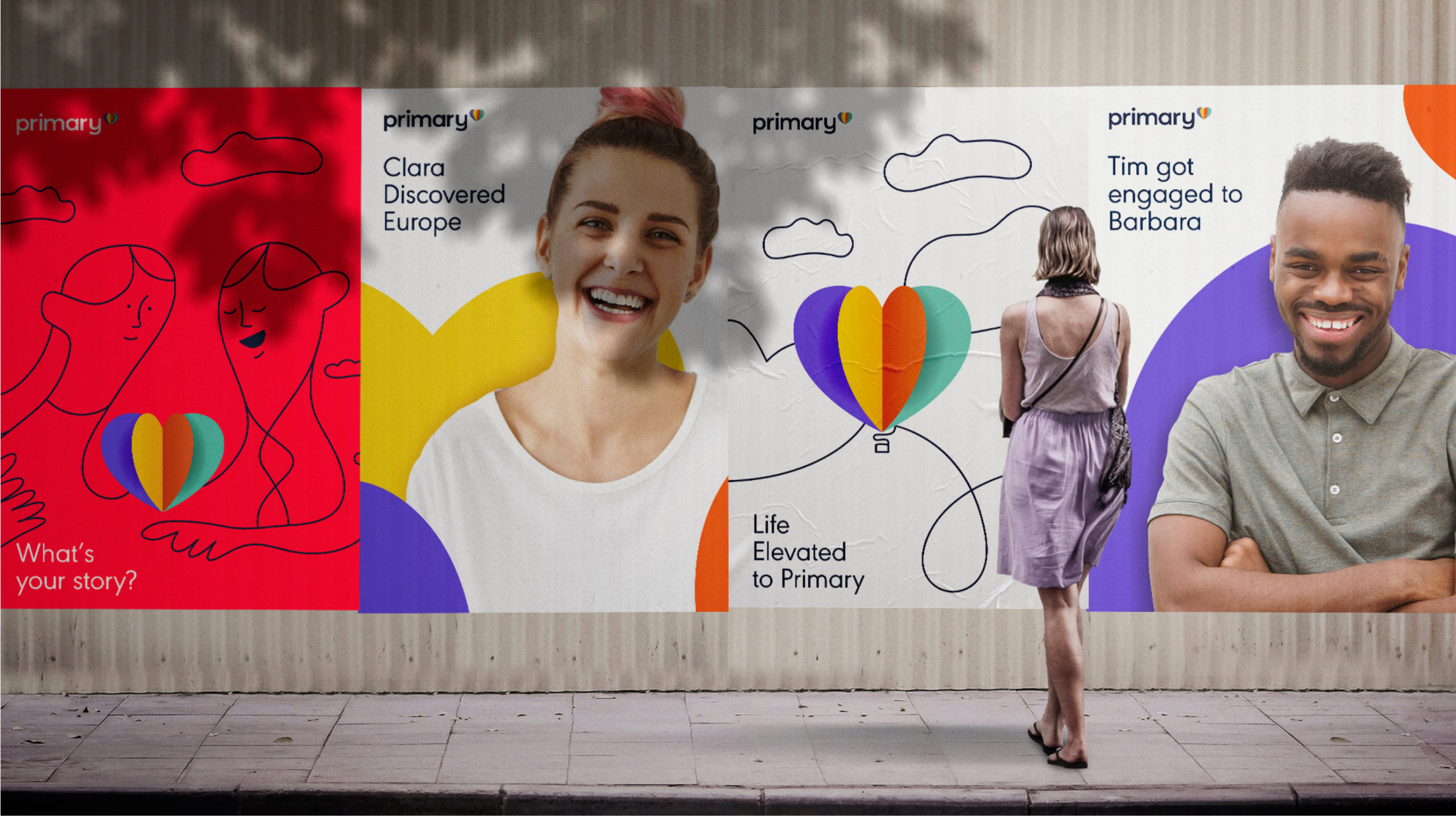
We wanted the audience to feel they are part of our story. To highlight the fact that our mission is for and thanks to our community. Our color palette is as vibrant and diverse as our audiences. And our one-liners depict situations and key players that make this ideal we strive for, a reality. Head teachers, company managers, medical institutions, university students and more.
.
We managed a united, coherent and strong personality that comes out as friendly, approachable and trustworthy.
A Fresh New Site
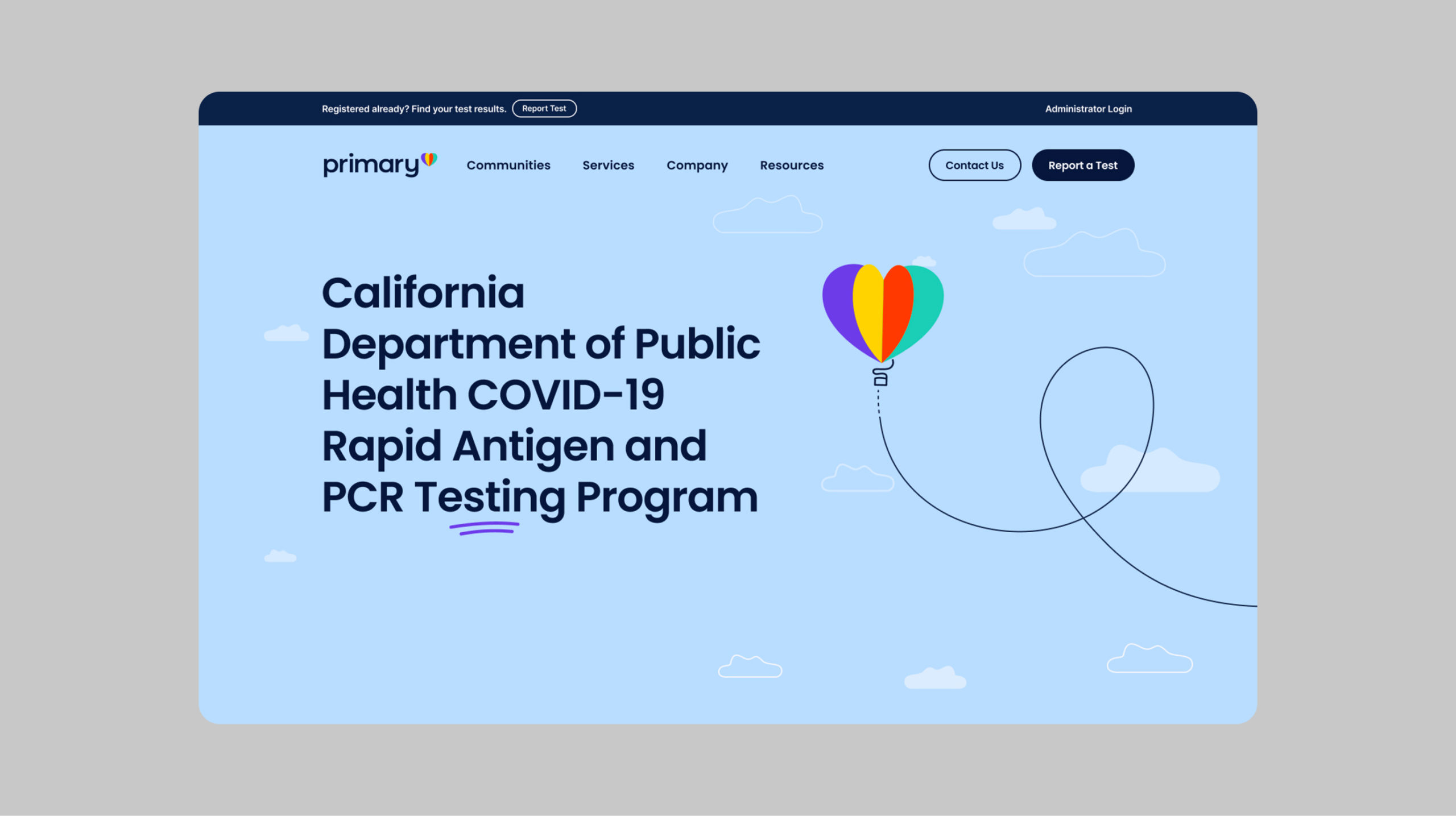
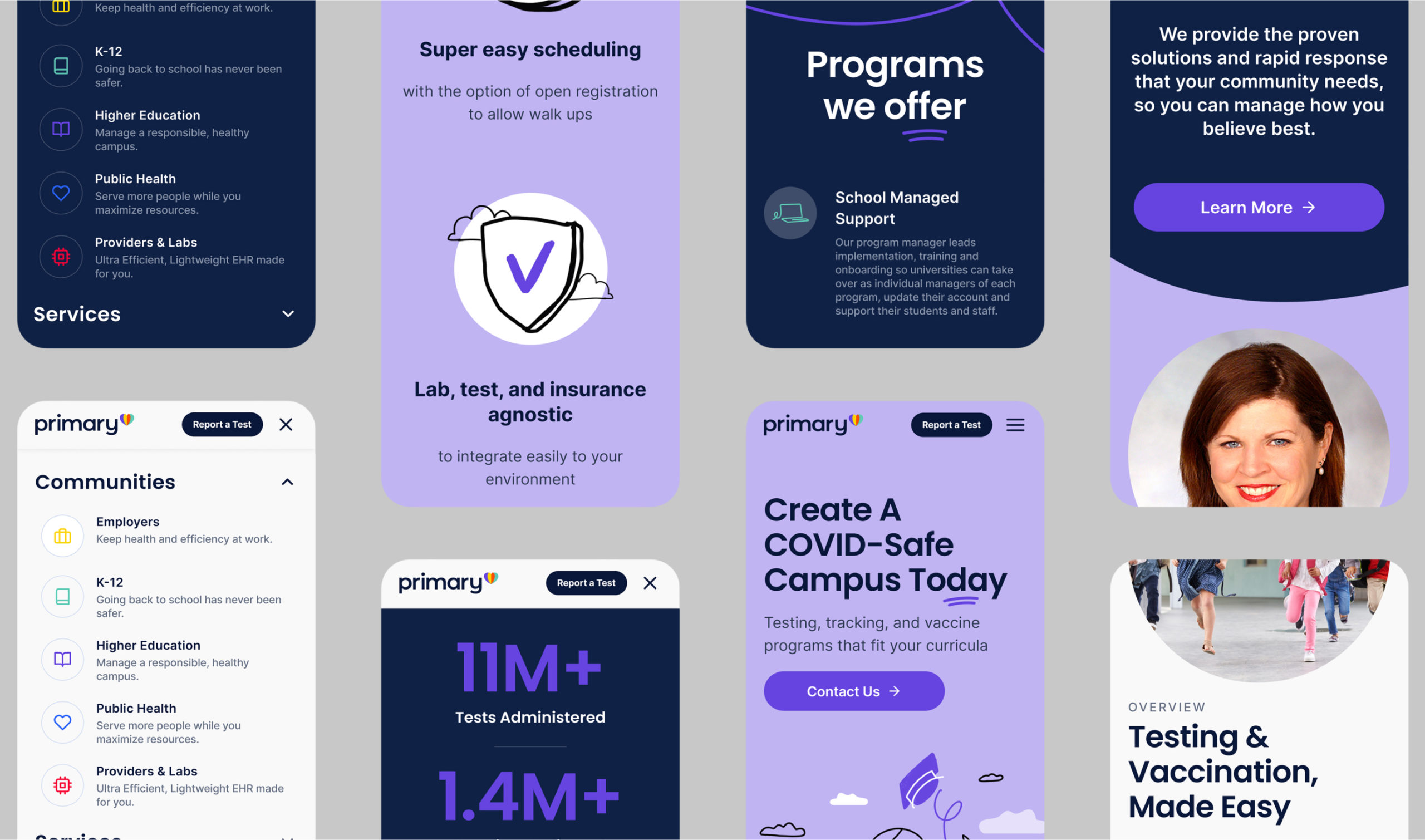
Once the whole identity was developed, we had to take it online. We gave the Primary.Health a clean face by reorganizing all data in it, roadmapping the user flow to create better UX and rewriting copy to make it easy to understand for everyone.
